UX/UI Design | Product Design | AI Prototyping
Redesigning an Internal Tool to Scale Pre-order Campaign Production
↓ 55% campaign setup time
(1h30 → 40 minutes per campaign)
A workflow redesign of DashBook’s internal campaign tool that reduced setup time from 1h30 to 40 minutes, enabling faster campaign launches in a high-growth environment.
Expert User Research
AI Prototyping
In house-Software
Project overview
Product: Content Creator Publishing Platform · Pre-order E-commerceCompany stage: Start-up /Scale-upRole: UX/UI Designer — Product Designer (Lead)Platform: Internal tool (Desktop)Status: Launched
Product Context
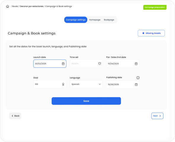
DashBook relies on time-bound pre-order campaigns where each book campaign must reach a minimum sales threshold within a limited time window to be published — typically 150 pre-orders within 44 days, with higher targets for high-profile creators.
To support this, internal editors and designers are responsible for creating and managing pre-order campaigns using a dedicated internal tool. These campaigns define how each book is presented across the homepage and product page, including all visual and textual assets. Because campaigns are time-sensitive and directly tied to revenue generation, their accuracy and timely activation are critical. Any delay or misconfiguration could prevent a campaign from going live as expected, directly impacting sales performance.
Problem
Creating a pre-order campaign was a time-consuming and error-prone process.
On average, designers required up to 1 hour and 30 minutes to build a single campaign. As the number of campaigns increased, this workflow became a bottleneck, limiting the team’s ability to keep up with production demands. Several structural issues within the tool contributed to this:
Homepage and product page assets were mixed, breaking the mental model of how campaigns were structured on the website.
Lack of logical organization of content and elements.
Manual correction of text content, increasing repetitive work .
No preview of uploaded assets, making validation difficult .
No system feedback for missing or incomplete elements.
Beyond inefficiency, the process also introduced operational risk.
Campaign activation depended on manual verification of launch date and time due to inconsistencies in the system. In some cases, errors were detected late — sometimes close to launch — creating uncertainty around whether campaigns would go live as expected.
This combination of inefficiency and lack of reliability directly impacted the team’s ability to scale campaign production and posed a risk to revenue generation.
My Role
I led the redesign of the internal campaign creation tool, working closely with the CMO, Product Manager, and development team. My role combined product thinking and UX execution:
- Defined the structure and logic of the new workflow to improve efficiency and reduce errors
- Conducted user research with editors and designers to identify friction points in the campaign creation process.
- Led usability testing to validate improvements and iterate on the solution.
- Collaborated with developers to align design decisions with technical feasibility and delivery timelines.
- Facilitated discussions with stakeholders to ensure the solution addressed both operational needs and business goals .
Challenges
- Balancing improvement with existing mental models
- Backend-driven structure
- Structural misalignment with the product
- Limited system feedback
- Inefficient and time-consuming workflow
- Technical constraints and delivery speed
Research & Insights
Contextual inquiry
I observed designers while they created pre-order campaigns in real working conditions, identifying friction points, repeated actions, and breakdowns throughout the flow.
Time-on-task analysis
I measured the average task completion time, which was 1h20 per campaign.
Semi-structured interviews
I conducted short interviews with 5 designers to validate assumptions and better understand the causes behind delays, workarounds, and manual corrections.
Key Observations
Designers had adapted to inefficiency
They had normalized working in a fragmented environment, relying on personal workarounds instead of a clear system.
Time was the most critical constraint
Creating one campaign took 1h20 on average, delaying higher-value creative and operational work.
The tool structure increased cognitive load
Homepage and Product page elements were mixed, while the lack of feedback made validation slower and more error-prone.
Lack of feedback increased manual verification
Missing elements and activation issues were often checked manually, sometimes close to launch.
To align design decisions with real usage patterns, I translated research insights into a user persona capturing the core needs, constraints, and behaviors of internal designers.
Anna Verde
25 | Barcelona Designer/editor


Anna Verde
Graphic Designer
Eva works as a designer in the CREA team at DashBook. She is also an editor. She handles 10 book projects per month. Their tasks include:
Goals
- Build the book project page in DashBook’s website.
- Make it in the less amount of time possible.
- See what they are building in real time.
- See in real time when they apply changes.
Motivations
Eva’d like to create new book projects more efficenttly in DashBook’s admin dashboard. so she can keep creating more books.
Pain Points
- UI copywriting leads to confussion when filling information or uploading visuals.
- Information is placed with no logic as the real world.
- When applying changes there are no visual FEEDBACK.
This persona guided key decisions around structure, feedback, and workflow simplification.
Design Strategy
The goal was not to replicate the website structure exactly, but to make the internal tool feel more aligned with it within the constraints of the existing system. The redesign focused on four principles:
- Structural alignment with the website
Reorganize content and assets in a way that better reflected how they were presented across the homepage and product page.
- Continuity over disruption
Preserve familiar interaction patterns where possible, improving the workflow without forcing designers to relearn the system from scratch.
- Clearer feedback and visibility
Improve the response to user actions through better asset preview, validation, and missing element feedback.
- Reduce operational friction
Minimize unnecessary manual work and context switching, including text correction outside the tool.
Key Decisions
Reorganized the workflow around content logic, not backend logic
The new structure grouped assets in a way that felt closer to how content was displayed on the homepage and product page, reducing cognitive load during campaign creation.
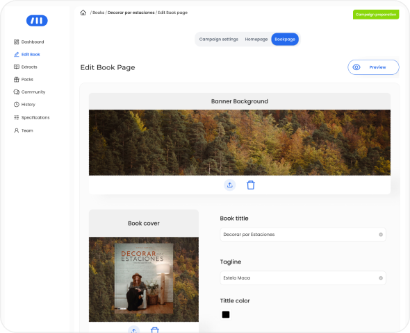
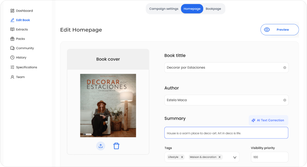
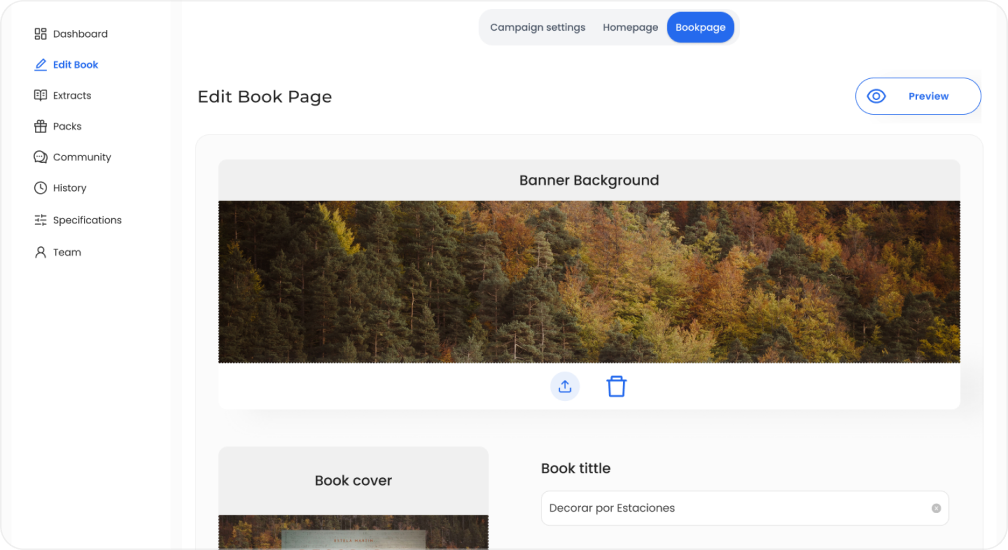
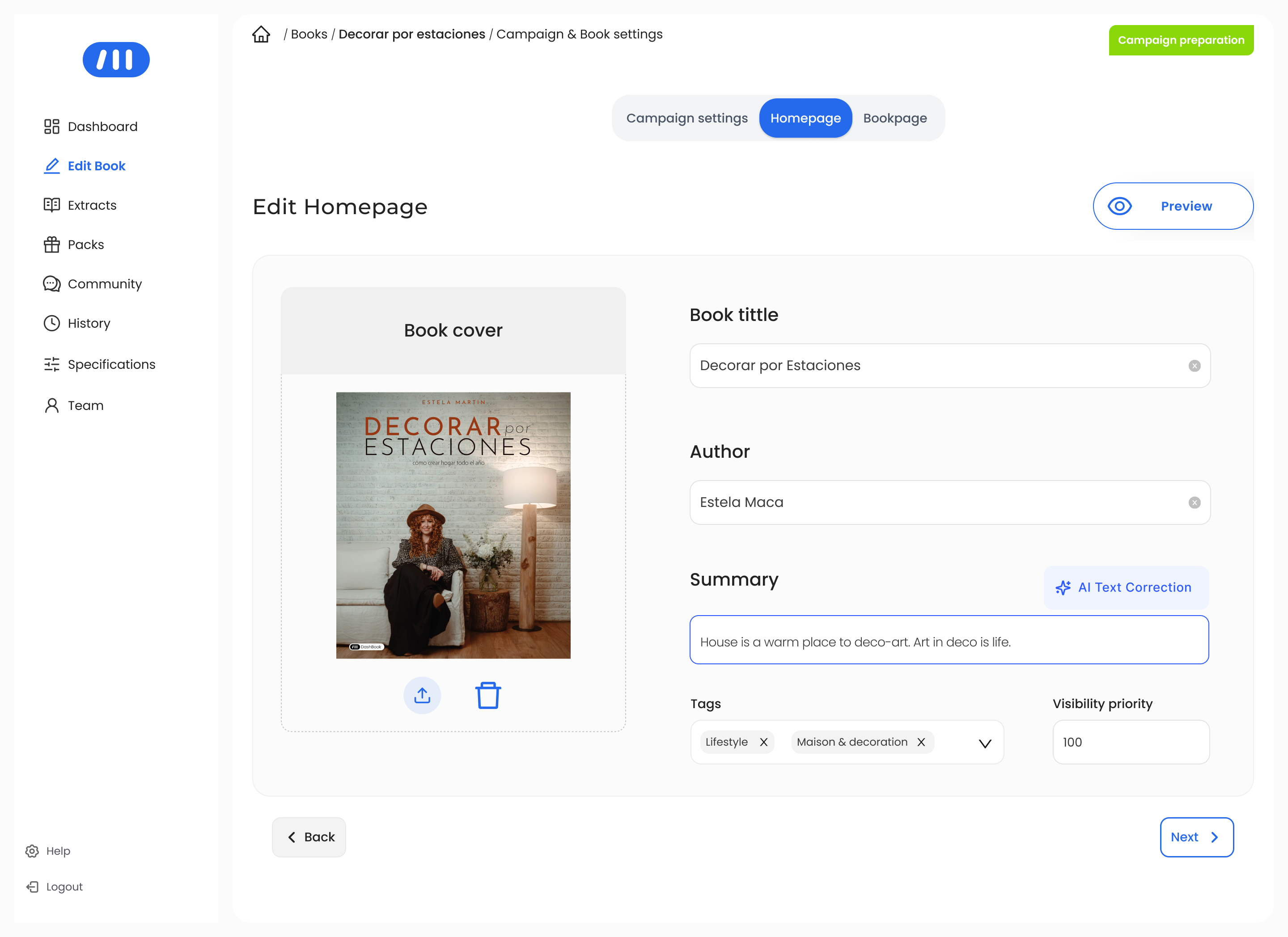
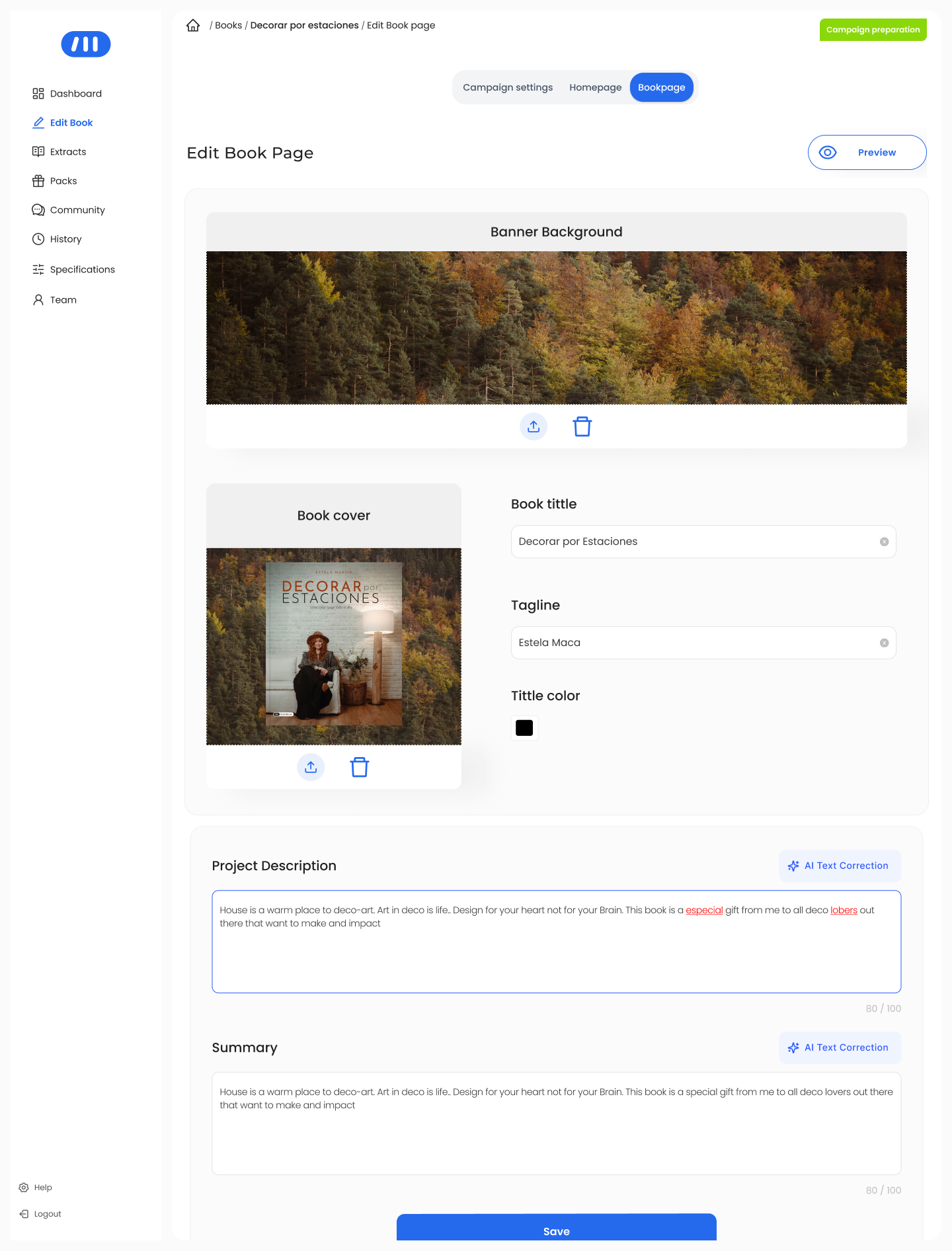
Separated homepage and book page content more clearly
Instead of mixing homepage and product page assets in the same space, the redesign introduced clearer separation between both content types, helping designers work in a way that better matched the final website structure.
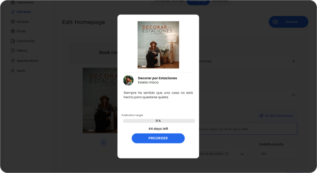
Each layout has its own space and its own logic : Homepage & Product page
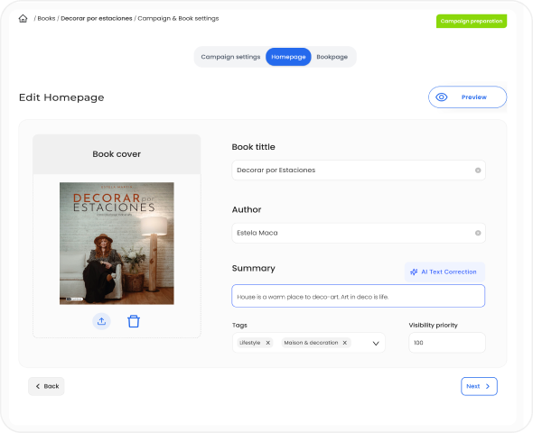
Improved asset visibility and content validation
The redesign made uploaded assets easier to preview and verify, reducing the need for manual checking and helping designers validate campaign content earlier in the process.
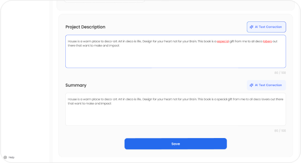
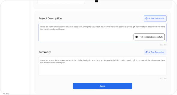
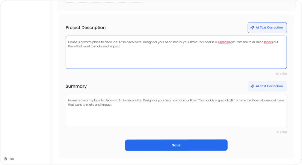
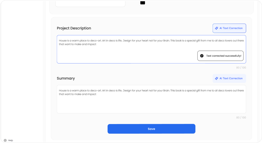
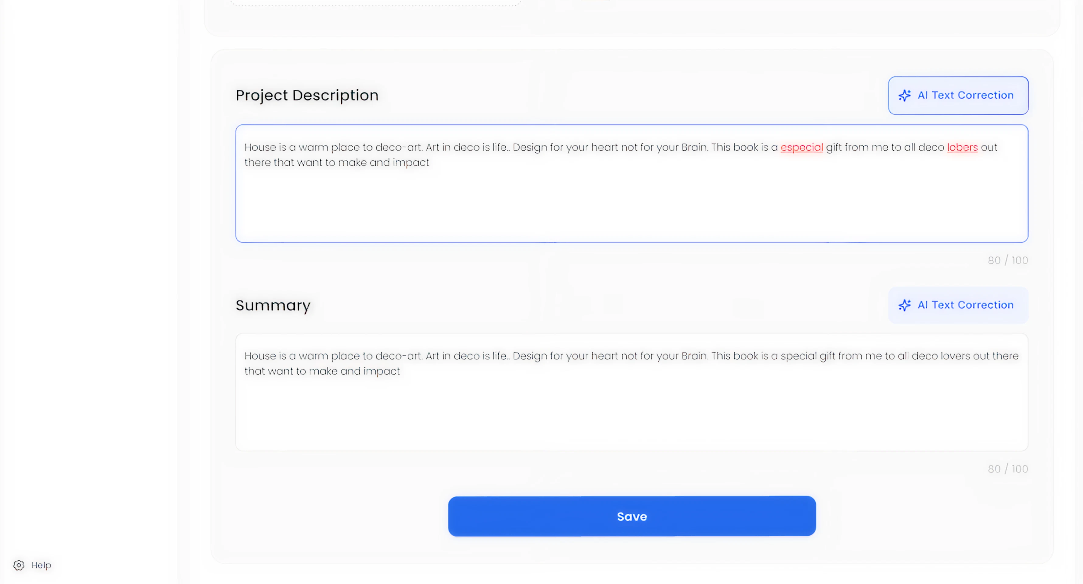
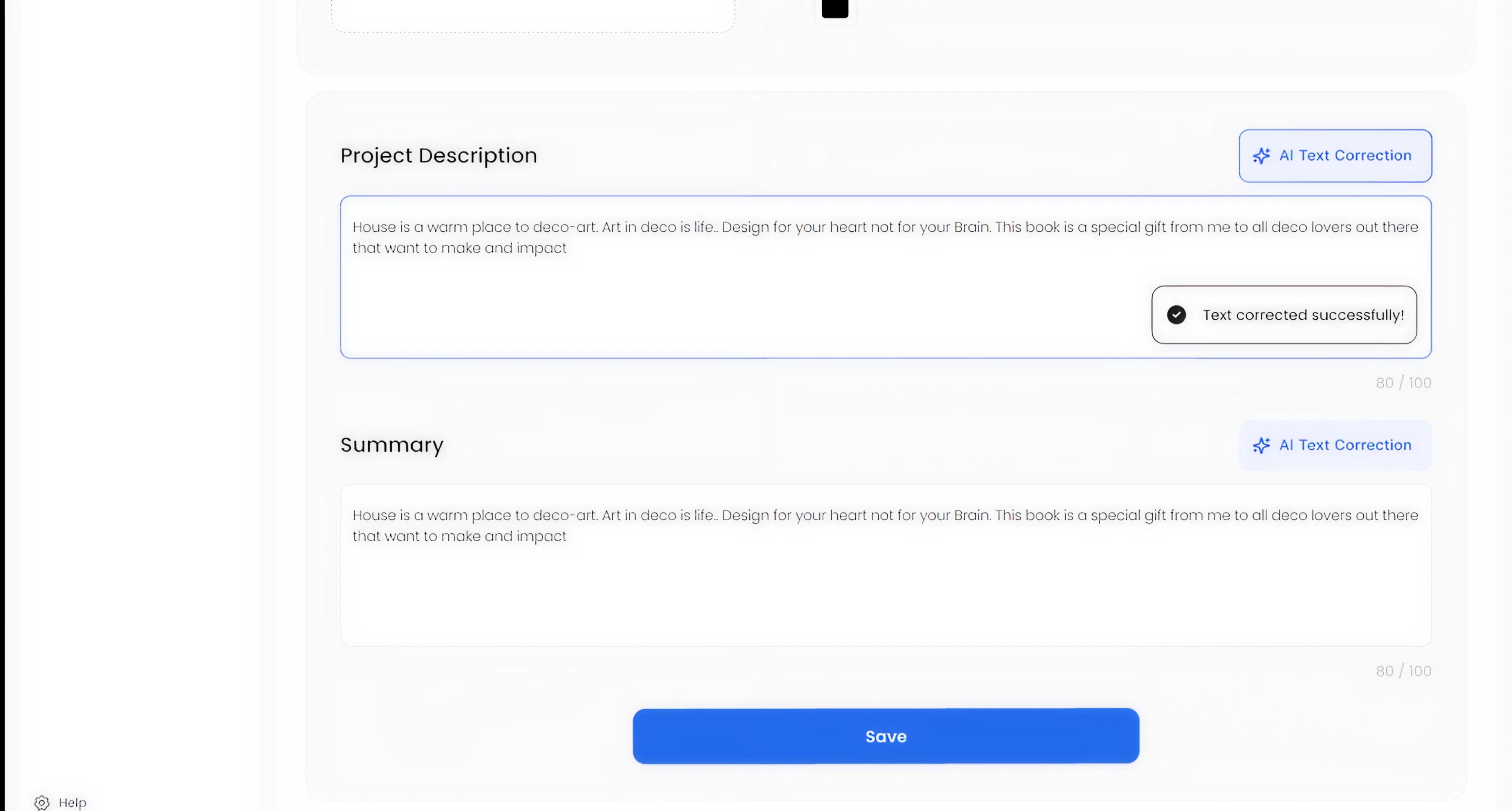
Text forms can be corrected by AI in every section
Designed a more self-sufficient editing workflow
To reduce context switching, the new design incorporated the concept of AI-assisted text correction directly inside text fields, supporting faster content editing without leaving the system.
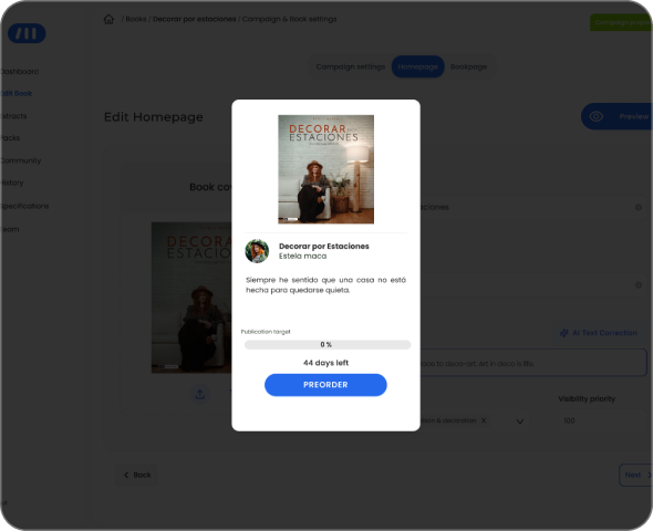
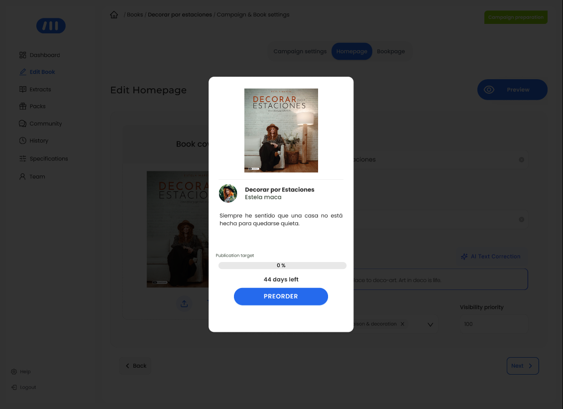
Preview feature of visual assets according to its location on webiste
These decisions came together in a more structured and efficient workflow for campaign creation.
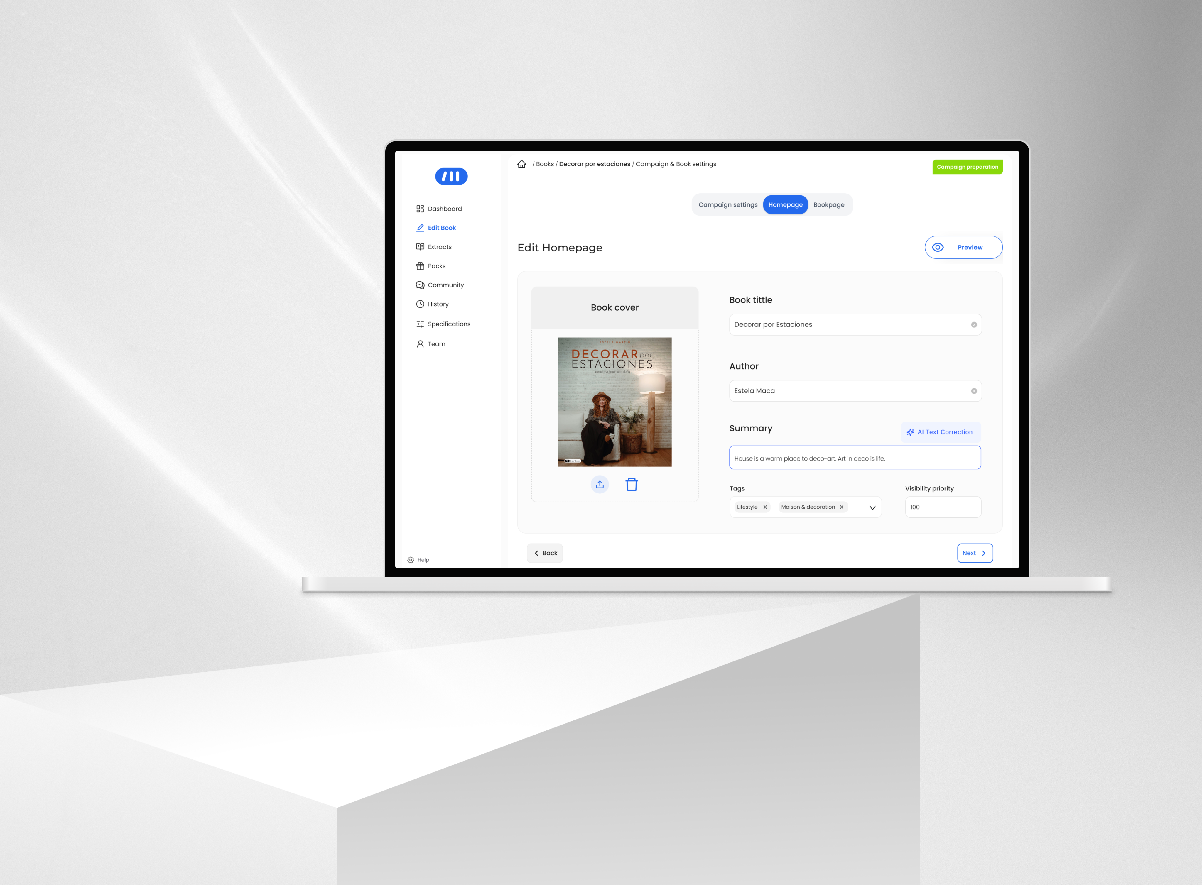
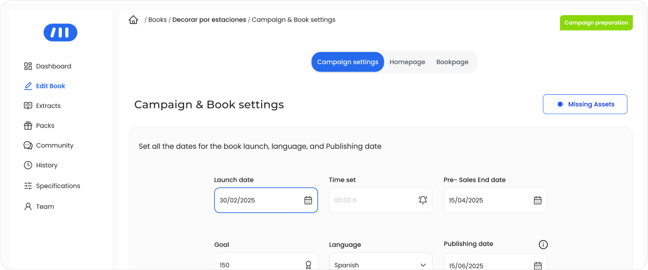
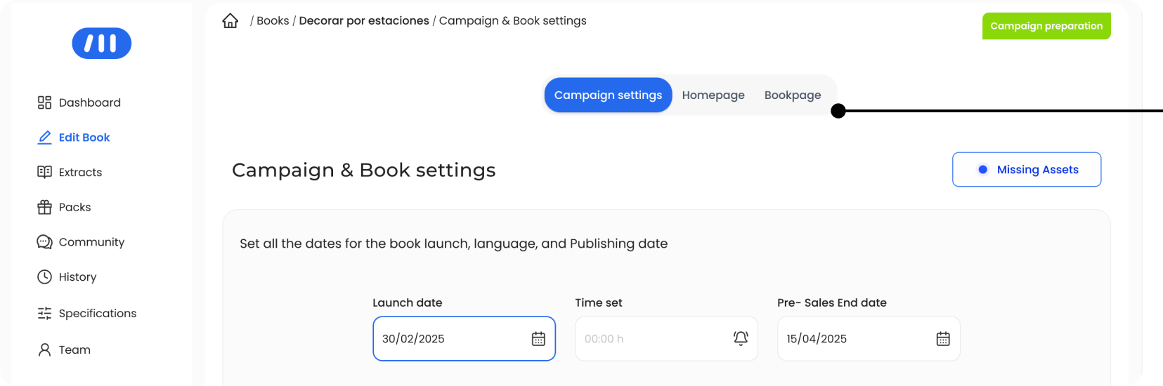
Final Experience Overview
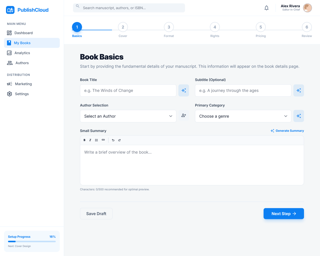
The redesigned tool introduces a more structured and intuitive workflow for creating pre-order campaigns, aligning content organization with how it is presented in the final product.:
- Designers can now move through the setup process in a clearer sequence from campaign settings to homepage and product page content with improved visibility, feedback, and asset management at each step.
- This results in a more predictable and efficient experience, reducing the need for manual verification and allowing designers to focus on higher-value tasks.
End-to-end campaign creation flow

With real-time feedback and clear asset visibility, campaign creation shifts from a fragmented process to a predictable and reliable workflow.
Impact
↓ 50% Reduction in Campaign
Setup Time
(1h20 → 40 minutes per campaign)
↑ Increased Campaign Production Capacity
The redesign transformed campaign creation from a fragmented and time-consuming process into a more structured and efficient workflow. By reorganizing content around a clearer logic and improving asset visibility, designers were able to complete campaigns faster and with greater confidence, reducing the need for manual verification and repeated actions.
Operational Impact
• Reduced time spent on repetitive setup tasks
• Fewer manual checks for missing or incorrect elements
• Improved clarity when managing campaign structure and assets
• Increased ability to handle a higher volume of campaigns
Product & Business Impact
• More predictable campaign setup process
• Reduced risk of last-minute issues before launch
• Improved reliability in campaign activation
• Supported scalability in a high-growth environment
By reducing internal bottlenecks and improving workflow reliability, the redesign enabled the team to scale campaign production more efficiently.
AI-Assisted Prototyping
To accelerate exploration under tight timelines, I used AI-assisted tools to quickly generate and compare multiple design directions. This allowed me to:
- Move faster from idea to prototype.
- Test workflows earlier with designers and editors.
- Discard weaker approaches before implementation.
- Better align with developers by evaluating impact vs. effort earlier in the process
The outcome was not driven by AI alone, but by combining rapid generation with deliberate product thinking.
AI exploration helped validate directions and surface trade-offs early in the process.
Applied Design direction

Explored a more structured, step-based workflow aligned with how campaigns are built.
Learnings
Designing internal tools dentro de un In-house Software requires balancing ideal UX with real operational constraints. The most effective solutions were not the most ambitious ones, but those that aligned with existing workflows, technical limitations, and team adoption. Here my key Takeaways:
- Internal tools require balancing ideal UX with real constraints
- Clear structure directly improves efficiency and reduces cognitive load
- Preserving familiar patterns can accelerate adoption
- Early validation leads to better product decisions
- AI accelerates exploration, but value comes from human judgment
From complex Dashboards to Checkout flows, see the breadth of my Design Projects.
More projects

JG
Work
About
Contact
UX/UI Design | Product Design | AI Prototyping
Redesigning an Internal Tool to Scale Pre-order Campaign Production
↓ 55% campaign setup time
(1h30 → 40 minutes per campaign)
A workflow redesign of DashBook’s internal campaign tool that reduced setup time from 1h30 to 40 minutes, enabling faster campaign launches in a high-growth environment.
Project overview
Product: Content Creator Publishing Platform · Pre-order E-commerceCompany stage: Start-up /Scale-upRole: UX/UI Designer — Product Designer (Lead)Platform: Internal tool (Desktop)Status: Launched
Product Context
DashBook relies on time-bound pre-order campaigns where each book campaign must reach a minimum sales threshold within a limited time window to be published — typically 150 pre-orders within 44 days, with higher targets for high-profile creators.
To support this, internal editors and designers are responsible for creating and managing pre-order campaigns using a dedicated internal tool. These campaigns define how each book is presented across the homepage and product page, including all visual and textual assets. Because campaigns are time-sensitive and directly tied to revenue generation, their accuracy and timely activation are critical. Any delay or misconfiguration could prevent a campaign from going live as expected, directly impacting sales performance.
Problem
Creating a pre-order campaign was a time-consuming and error-prone process.
On average, designers required up to 1 hour and 30 minutes to build a single campaign. As the number of campaigns increased, this workflow became a bottleneck, limiting the team’s ability to keep up with production demands. Several structural issues within the tool contributed to this:
Homepage and product page assets were mixed, breaking the mental model of how campaigns were structured on the website.
Lack of logical organization of content and elements.
Manual correction of text content, increasing repetitive work .
No preview of uploaded assets, making validation difficult .
No system feedback for missing or incomplete elements.
Beyond inefficiency, the process also introduced operational risk.
Campaign activation depended on manual verification of launch date and time due to inconsistencies in the system. In some cases, errors were detected late — sometimes close to launch — creating uncertainty around whether campaigns would go live as expected.
This combination of inefficiency and lack of reliability directly impacted the team’s ability to scale campaign production and posed a risk to revenue generation.
My Role
I led the redesign of the internal campaign creation tool, working closely with the CMO, Product Manager, and development team. My role combined product thinking and UX execution:
- Defined the structure and logic of the new workflow to improve efficiency and reduce errors
- Conducted user research with editors and designers to identify friction points in the campaign creation process.
- Led usability testing to validate improvements and iterate on the solution.
- Collaborated with developers to align design decisions with technical feasibility and delivery timelines.
- Facilitated discussions with stakeholders to ensure the solution addressed both operational needs and business goals .
Challenges
- Balancing improvement with existing mental models
- Backend-driven structure
- Structural misalignment with the product
- Limited system feedback
- Inefficient and time-consuming workflow
- Technical constraints and delivery speed
Research & Insights
Contextual inquiry
I observed designers while they created pre-order campaigns in real working conditions, identifying friction points, repeated actions, and breakdowns throughout the flow.
Time-on-task analysis
I measured the average task completion time, which was 1h20 per campaign.
Semi-structured interviews
I conducted short interviews with 5 designers to validate assumptions and better understand the causes behind delays, workarounds, and manual corrections.
Key Observations
Designers had adapted to inefficiency
They had normalized working in a fragmented environment, relying on personal workarounds instead of a clear system.
The tool structure increased cognitive load
Homepage and Product page elements were mixed, while the lack of feedback made validation slower and more error-prone.
Time was the most critical constraint
Creating one campaign took 1h20 on average, delaying higher-value creative and operational work.
Lack of feedback increased manual verification
Missing elements and activation issues were often checked manually, sometimes close to launch.
To align design decisions with real usage patterns, I translated research insights into a user persona capturing the core needs, constraints, and behaviors of internal designers.
Anna Verde
25 | Barcelona Designer/editor

Anna Verde
Graphic Designer
Eva works as a designer in the CREA team at DashBook. She is also an editor. She handles 10 book projects per month. Their tasks include:
Goals
- Build the book project page in DashBook’s website.
- Make it in the less amount of time possible.
- See what they are building in real time.
- See in real time when they apply changes.
Motivations
Eva’d like to create new book projects more efficenttly in DashBook’s admin dashboard. so she can keep creating more books.
Pain Points
- UI copywriting leads to confussion when filling information or uploading visuals.
- Information is placed with no logic as the real world.
- When applying changes there are no visual FEEDBACK.
This persona guided key decisions around structure, feedback, and workflow simplification.
Design Strategy
The goal was not to replicate the website structure exactly, but to make the internal tool feel more aligned with it within the constraints of the existing system. The redesign focused on four principles:
- Structural alignment with the website
Reorganize content and assets in a way that better reflected how they were presented across the homepage and product page.
- Continuity over disruption
Preserve familiar interaction patterns where possible, improving the workflow without forcing designers to relearn the system from scratch.
- Clearer feedback and visibility
Improve the response to user actions through better asset preview, validation, and missing element feedback.
- Reduce operational friction
Minimize unnecessary manual work and context switching, including text correction outside the tool.
Key Decisions
Reorganized the workflow around content logic, not backend logic
The new structure grouped assets in a way that felt closer to how content was displayed on the homepage and product page, reducing cognitive load during campaign creation.

Website Structure
Separated homepage and book page content more clearly
Instead of mixing homepage and product page assets in the same space, the redesign introduced clearer separation between both content types, helping designers work in a way that better matched the final website structure.
Each layout has its own space and its own logic : Homepage & Product page
Improved asset visibility and content validation
The redesign made uploaded assets easier to preview and verify, reducing the need for manual checking and helping designers validate campaign content earlier in the process.
Preview feature of visual assets according to its location on webiste
Designed a more self-sufficient editing workflow
To reduce context switching, the new design incorporated the concept of AI-assisted text correction directly inside text fields, supporting faster content editing without leaving the system.
Text forms can be corrected by AI in every section
These decisions came together in a more structured and efficient workflow for campaign creation.
Final Experience Overview
The redesigned tool introduces a more structured and intuitive workflow for creating pre-order campaigns, aligning content organization with how it is presented in the final product.:
- Designers can now move through the setup process in a clearer sequence from campaign settings to homepage and product page content with improved visibility, feedback, and asset management at each step.
- This results in a more predictable and efficient experience, reducing the need for manual verification and allowing designers to focus on higher-value tasks.
End-to-end campaign creation flow
Structured workflow aligned with content logic
Improved asset visibility and validation
Reduced context switching during campaign setup
With real-time feedback and clear asset visibility, campaign creation shifts from a fragmented process to a predictable and reliable workflow.
Impact
↓ 50% Reduction in Campaign
Setup Time
(1h20 → 40 minutes per campaign)
↑ Increased Campaign Production Capacity
The redesign transformed campaign creation from a fragmented and time-consuming process into a more structured and efficient workflow. By reorganizing content around a clearer logic and improving asset visibility, designers were able to complete campaigns faster and with greater confidence, reducing the need for manual verification and repeated actions.
Operational Impact
• Reduced time spent on repetitive setup tasks
• Fewer manual checks for missing or incorrect elements
• Improved clarity when managing campaign structure and assets
• Increased ability to handle a higher volume of campaigns
Product & Business Impact
• More predictable campaign setup process
• Reduced risk of last-minute issues before launch
• Improved reliability in campaign activation
• Supported scalability in a high-growth environment
By reducing internal bottlenecks and improving workflow reliability, the redesign enabled the team to scale campaign production more efficiently.
AI-Assisted Prototyping
To accelerate exploration under tight timelines, I used AI-assisted tools to quickly generate and compare multiple design directions. This allowed me to:
- Move faster from idea to prototype.
- Test workflows earlier with designers and editors.
- Discard weaker approaches before implementation.
- Better align with developers by evaluating impact vs. effort earlier in the process
The outcome was not driven by AI alone, but by combining rapid generation with deliberate product thinking.
AI exploration helped validate directions and surface trade-offs early in the process.
Applied Design direction
Explored a more structured, step-based workflow aligned with how campaigns are built.
Discarded Design direction
Introduced more complex interactions, but increased technical effort without solving core usability issues.
Learnings
Designing internal tools dentro de un In-house Software requires balancing ideal UX with real operational constraints. The most effective solutions were not the most ambitious ones, but those that aligned with existing workflows, technical limitations, and team adoption. Here my key Takeaways:
- Internal tools require balancing ideal UX with real constraints
- Clear structure directly improves efficiency and reduces cognitive load
- Preserving familiar patterns can accelerate adoption
- Early validation leads to better product decisions
- AI accelerates exploration, but value comes from human judgment
From complex Dashboards to Checkout flows, see the breadth of my Design Projects.
More projects

JG
Work
About
Contact
UX/UI Design | Product Design | AI Prototyping
Redesigning an Internal Tool to Scale Pre-order Campaign Production
A workflow redesign of DashBook’s internal campaign tool that reduced setup time from 1h30 to 40 minutes, enabling faster campaign launches in a high-growth environment.
↓ 55% campaign setup time
(1h30 → 40 minutes per campaign)
Project overview
Product: Content Creator Publishing Platform · Pre-order E-commerceCompany stage: Start-up /Scale-upRole: UX/UI Designer — Product Designer (Lead)Platform: Internal tool (Desktop)Status: Launched
Product Context
DashBook relies on time-bound pre-order campaigns where each book campaign must reach a minimum sales threshold within a limited time window to be published — typically 150 pre-orders within 44 days, with higher targets for high-profile creators.
To support this, internal editors and designers are responsible for creating and managing pre-order campaigns using a dedicated internal tool. These campaigns define how each book is presented across the homepage and product page, including all visual and textual assets. Because campaigns are time-sensitive and directly tied to revenue generation, their accuracy and timely activation are critical. Any delay or misconfiguration could prevent a campaign from going live as expected, directly impacting sales performance.
Problem
Creating a pre-order campaign was a time-consuming and error-prone process.
On average, designers required up to 1 hour and 30 minutes to build a single campaign. As the number of campaigns increased, this workflow became a bottleneck, limiting the team’s ability to keep up with production demands. Several structural issues within the tool contributed to this:
Homepage and product page assets were mixed, breaking the mental model of how campaigns were structured on the website.
Lack of logical organization of content and elements.
Manual correction of text content, increasing repetitive work .
No preview of uploaded assets, making validation difficult .
No system feedback for missing or incomplete elements.
Beyond inefficiency, the process also introduced operational risk.
Campaign activation depended on manual verification of launch date and time due to inconsistencies in the system. In some cases, errors were detected late — sometimes close to launch — creating uncertainty around whether campaigns would go live as expected.
This combination of inefficiency and lack of reliability directly impacted the team’s ability to scale campaign production and posed a risk to revenue generation.
Structural Alignment Comparison
Contrasting the user's conceptual mental model with the fragmented architecture of the production editing tool.


Manual navigation
Constants context switching required for a single update.

Structural Misalignment

Increased cognitive load
Finding related elements across disjointed sections.

Website Assets
Mental model aligned with public site structure.
Homepage (HP)

Book title

Book cover image

Small Summary

Author Pic & name

Category tag

Days left

Language
Product Page (PDP)
Book title
Subtitle
Days left
Background image
Cover image with background
Project Description
Summary

Packs
Extracts

Campaign Tool
Fragmented implementation logic.
Edit Book
Book title
(HP, PDP)
Subtitle
(PDP)
Author
(HP, PDP)
Cover image
(HP)
Small Summary
(HP)
Project Description
(PDP)
Tag
(Settings)
Publishing date
(PDP)
Summary
(PDP)
Background image
(PDP)
Cover image with background
(PDP)
Language
(Settings)
Campaign Details

Start date
(HP, PDP)
End date
(HP, PDP)

Goal
(HP, PDP)
Packs

Packs images
(PDP)
Extracts
Extracts images
(PDP)
Campaign activation
Schedule campaign
(HP, PDP)
My Role
I led the redesign of the internal campaign creation tool, working closely with the CMO, Product Manager, and development team. My role combined product thinking and UX execution:
- Defined the structure and logic of the new workflow to improve efficiency and reduce errors
- Conducted user research with editors and designers to identify friction points in the campaign creation process.
- Led usability testing to validate improvements and iterate on the solution.
- Collaborated with developers to align design decisions with technical feasibility and delivery timelines.
- Facilitated discussions with stakeholders to ensure the solution addressed both operational needs and business goals .
Challenges
- Balancing improvement with existing mental models
- Backend-driven structure
- Structural misalignment with the product
- Limited system feedback
- Inefficient and time-consuming workflow
- Technical constraints and delivery speed
Research & Insights
Contextual inquiry
I observed designers while they created pre-order campaigns in real working conditions, identifying friction points, repeated actions, and breakdowns throughout the flow.
Time-on-task analysis
I measured the average task completion time, which was 1h20 per campaign.
Semi-structured interviews
I conducted short interviews with 5 designers to validate assumptions and better understand the causes behind delays, workarounds, and manual corrections.
Key Observations
Designers had adapted to inefficiency
They had normalized working in a fragmented environment, relying on personal workarounds instead of a clear system.
Time was the most critical constraint
Creating one campaign took 1h20 on average, delaying higher-value creative and operational work.
The tool structure increased cognitive load
Homepage and Product page elements were mixed, while the lack of feedback made validation slower and more error-prone.
Lack of feedback increased manual verification
Missing elements and activation issues were often checked manually, sometimes close to launch.
To align design decisions with real usage patterns, I translated research insights into a user persona capturing the core needs, constraints, and behaviors of internal designers.
Anna Verde
25 | Barcelona Designer/editor

Anna Verde
Graphic Designer
Eva works as a designer in the CREA team at DashBook. She is also an editor. She handles 10 book projects per month. Their tasks include:
Goals
- Build the book project page in DashBook’s website.
- Make it in the less amount of time possible.
- See what they are building in real time.
- See in real time when they apply changes.
Motivations
Eva’d like to create new book projects more efficenttly in DashBook’s admin dashboard. so she can keep creating more books.
Pain Points
- UI copywriting leads to confussion when filling information or uploading visuals.
- Information is placed with no logic as the real world.
- When applying changes there are no visual FEEDBACK.
This persona guided key decisions around structure, feedback, and workflow simplification.
Design Strategy
The goal was not to replicate the website structure exactly, but to make the internal tool feel more aligned with it within the constraints of the existing system. The redesign focused on four principles:
- Structural alignment with the website
Reorganize content and assets in a way that better reflected how they were presented across the homepage and product page.
- Continuity over disruption
Preserve familiar interaction patterns where possible, improving the workflow without forcing designers to relearn the system from scratch.
- Clearer feedback and visibility
Improve the response to user actions through better asset preview, validation, and missing element feedback.
- Reduce operational friction
Minimize unnecessary manual work and context switching, including text correction outside the tool.
Key Decisions
Reorganized the workflow around content logic, not backend logic
The new structure grouped assets in a way that felt closer to how content was displayed on the homepage and product page, reducing cognitive load during campaign creation.
Website Structure
Separated homepage and book page content more clearly
Instead of mixing homepage and product page assets in the same space, the redesign introduced clearer separation between both content types, helping designers work in a way that better matched the final website structure.
Each layout has its own space and its own logic : Homepage & Product page
Improved asset visibility and content validation
The redesign made uploaded assets easier to preview and verify, reducing the need for manual checking and helping designers validate campaign content earlier in the process.
Preview feature of visual assets according to its location on webiste
Designed a more self-sufficient editing workflow
To reduce context switching, the new design incorporated the concept of AI-assisted text correction directly inside text fields, supporting faster content editing without leaving the system.
Text forms can be corrected by AI in every section
These decisions came together in a more structured and efficient workflow for campaign creation.
Final Experience Overview
The redesigned tool introduces a more structured and intuitive workflow for creating pre-order campaigns, aligning content organization with how it is presented in the final product.:
- Designers can now move through the setup process in a clearer sequence from campaign settings to homepage and product page content with improved visibility, feedback, and asset management at each step.
- This results in a more predictable and efficient experience, reducing the need for manual verification and allowing designers to focus on higher-value tasks.
End-to-end campaign creation flow
Structured workflow aligned with content logic
Improved asset visibility and validation
Reduced context switching during campaign setup
With real-time feedback and clear asset visibility, campaign creation shifts from a fragmented process to a predictable and reliable workflow.
Impact
↓ 50% Reduction in Campaign Setup Time
(1h20 → 40 minutes per campaign)
↑ Increased Campaign Production Capacity
The redesign transformed campaign creation from a fragmented and time-consuming process into a more structured and efficient workflow. By reorganizing content around a clearer logic and improving asset visibility, designers were able to complete campaigns faster and with greater confidence, reducing the need for manual verification and repeated actions.
Operational Impact
• Reduced time spent on repetitive setup tasks
• Fewer manual checks for missing or incorrect elements
• Improved clarity when managing campaign structure and assets
• Increased ability to handle a higher volume of campaigns
Product & Business Impact
• More predictable campaign setup process
• Reduced risk of last-minute issues before launch
• Improved reliability in campaign activation
• Supported scalability in a high-growth environment
By reducing internal bottlenecks and improving workflow reliability, the redesign enabled the team to scale campaign production more efficiently.
AI-Assisted Prototyping
To accelerate exploration under tight timelines, I used AI-assisted tools to quickly generate and compare multiple design directions. This allowed me to:
- Move faster from idea to prototype.
- Test workflows earlier with designers and editors.
- Discard weaker approaches before implementation.
- Better align with developers by evaluating impact vs. effort earlier in the process
The outcome was not driven by AI alone, but by combining rapid generation with deliberate product thinking.
AI exploration helped validate directions and surface trade-offs early in the process.
Applied Design direction
Explored a more structured, step-based workflow aligned with how campaigns are built.
Discarded Design direction
Introduced more complex interactions, but increased technical effort without solving core usability issues.
Learnings
Designing internal tools dentro de un In-house Software requires balancing ideal UX with real operational constraints. The most effective solutions were not the most ambitious ones, but those that aligned with existing workflows, technical limitations, and team adoption. Here my key Takeaways:
- Internal tools require balancing ideal UX with real constraints.
- Clear structure directly improves efficiency and reduces cognitive load.
- Preserving familiar patterns can accelerate adoption.
- Early validation leads to better product decisions.
- AI accelerates exploration, but value comes from human judgment.
From complex Dashboards to Checkout flows, see the breadth of my Design Projects.
More projects