
JG
Work
About
Contact
Checkout Redesign for a
Pre-order E-commerce Platform
A mobile-first redesign of DashBook’s checkout focused on reducing failed purchases and improving conversion during high-intent
pre-order campaigns.
↓ 89 % failed purchase attempts(520 → ~60 per month)
E-commerce
User Research
Mobile first
Project overview
Product: Content Creator Publishing Platform · Pre-order E-commerceCompany stage: Scale-upRole: UX/UI Designer — Lead DesignerPlatform: Mobile-first (Desktop supported)Status: Launched
Problem
Despite strong purchase intent and time-sensitive campaigns, the checkout had evolved without a clear mobile-first structure. The flow was desktop-oriented, required mandatory registration, and included inconsistent hierarchy, unclear payment states, and fragile error handling.
This resulted in:
- High rates of failed purchase attempts.
- Repeated retries from the same users.
- Increased support tickets related to payment issues.
- Revenue leakage during peak campaign moments.
These issues not only hurt conversion, but also prevented scalability, directly impacting presale goals, author success, and overall revenue growth. The issue wasn’t lack of demand it was friction at the most critical stage of the purchase journey.
Context
DashBook had transitioned from a startup to a scale-up, running dozens of simultaneous pre-order campaigns each month. The checkout represented the final and most critical step in this time-bound sales journey, where campaign success depended on reaching a minimum threshold within 44 days. Buyers were primarily followers of the creator—high-intent but low-frequency customers often making a one-time purchase during a limited window. With most traffic coming from mobile devices, clarity, speed, and predictability were essential at the moment of payment.
In this context, even small points of friction had an outsized impact on campaign performance and overall revenue.


My Role
I worked as UX/UI Designer and acted as Lead Designer on this initiative, owning the checkout redesign from problem definition to delivery. While the initial request focused on visual improvements, the scope quickly expanded to address structural conversion issues. I redefined the checkout flow architecture, established mobile-first UX principles, and prioritized high-impact friction points in collaboration with the Product Manager and engineering team.
User Behavior Snapshot
(May–July)
From May to July, analysis of user behavior revealed a critical breakdown in the checkout funnel:
- 520 failed purchase attempts per month
- 80,780 users added a product to cart
- 56,000 completed their purchase (69% checkout completion rate)
- +85% of traffic came from mobile devices

Mobile Users
198,474
6.8% of total traffic

Added to Cart
80,780 users
39.4% conversion rate

Failed purchase
520 failed attempts / month

Checkout
56,000 orders
69.3% checkout completion
Challenges & Insights
Challenges
- Mobile-dominant traffic in a desktop-oriented flow
- Mandatory authentication and rigid backend dependencies
- Technical debt and lack of design foundations
- High-intent, low-frequency buyers
Insights
Insights were derived from:
- Recurring checkout-related support tickets.
- Failed payment patterns and repeated retries.
- Direct collaboration with the Product Manager and engineering team.
- Reviewing user behavior during active campaign peaks.
- Internal Data analysis and Google Analytics.
Key Insights
High-intent, low-frequency buyers
Even emotionally invested buyers abandon when checkout feels unclear or unstable.
Mobile-first is not a visual decision, but a structural one
Clear hierarchy, fewer decisions per screen,input states, error handling, and immediate feedback are critical under constrained conditions.
Checkout is a fragile system
Small UX inconsistencies can cascade into failed payments and revenue loss.
Building empathy: User Persona
To move from raw insights to actionable decisions, I synthesized the observed behaviors, motivations, and friction points into structured representations of the user experience. Based on the research findings, I created a Persona to keep design decisions grounded in real user needs and behaviors throughout the process.
Emma
28 | Paris| Marketing Manager


Emma Laurent
Marketing Manager
Emma likes to follow every post and news of her favourite Influencer. She just found that the influencer just write a book and is on presales.
Goals
- See the influencer video post and know more about it.
- Go to DashBook’s web and see the book project.
- Buy the book on presales.
- Leave a support comment to the influencer.
Motivations
Emma wants to buy the book no matter what and wait for it to be published. She wants to support her favourite influencer.
Pain Points
- sHE Doesn’t trust websites that never heard about.
- She is used to buy things with her cellphone.
- She has to register several times.
- she can’t find where is her purchase on the website.
Experience Map
To better understand where friction and drop-offs were occurring, I mapped the end-to-end user journey — capturing key interactions, emotional states, and potential abandonment points across each phase.
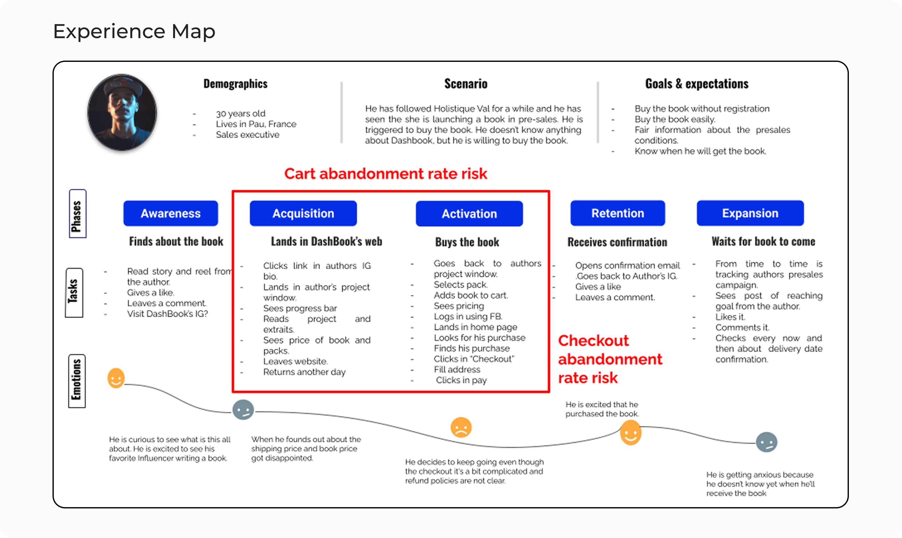
The journey revealed that the highest risk of drop-off concentrated between the acquisition and activation phases particularly during the transition into checkout. At this stage, users encounter multiple friction points: unclear pricing, unexpected shipping costs, forced account creation, and lack of trust signals.
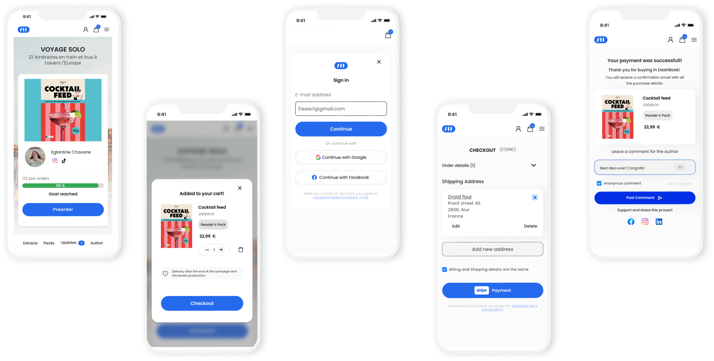
Design decisions
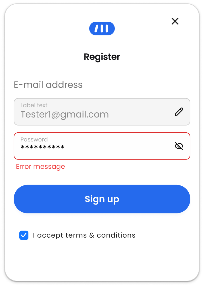
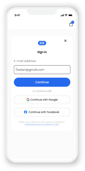
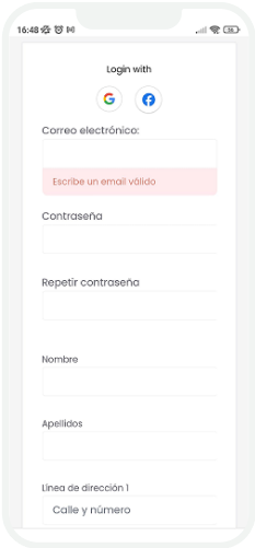
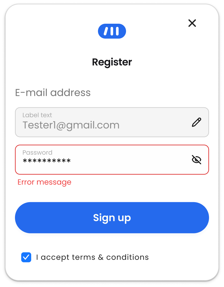
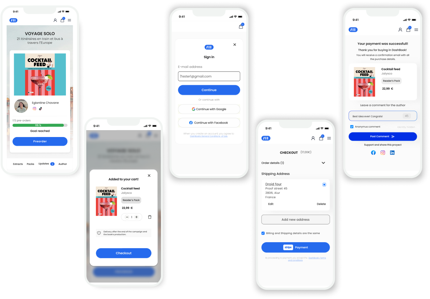
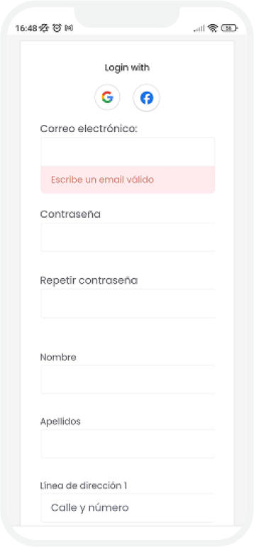
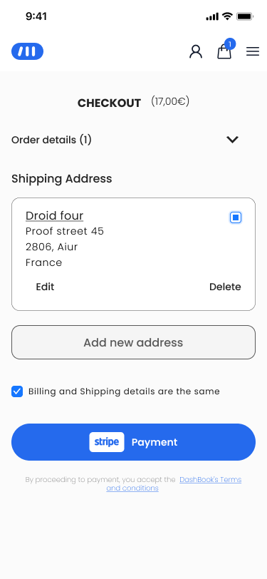
1. Progressive, Inline Authentication
Reframed authentication as a progressive step within the checkout rather than a blocking prerequisite.
Before
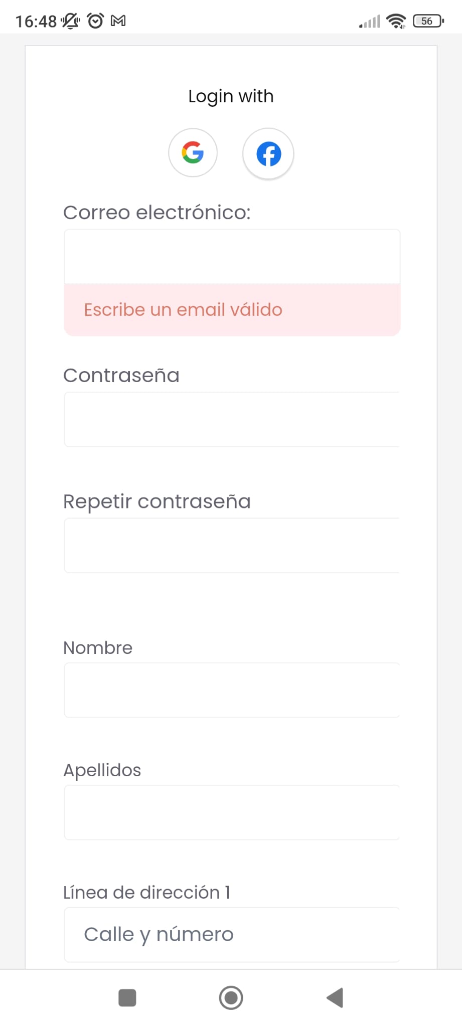
- Full registration required before continuing.
- Context switch.
- Redirect to the homepage after registration.
After
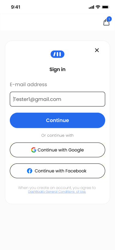
What changed?
- Email-first entry point to detect returning vs new users early.
- Routed users dynamically into sign-in or a lightweight registration
- Reduced required fields and removed unnecessary friction from the initial step
Constraint: Full guest checkout was not feasible due to backend dependencies.
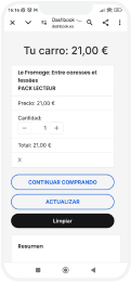
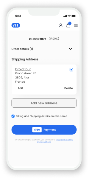
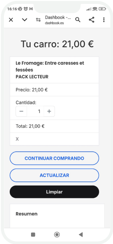
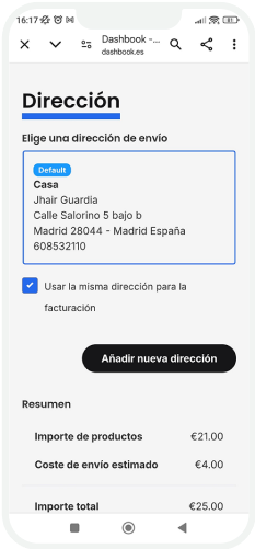
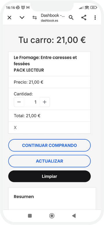
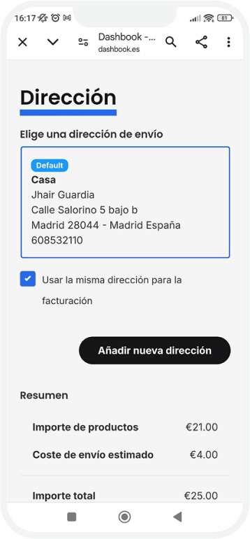
2. Mobile-First Structural Hierarchy
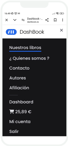
Rebuilt the checkout structure around mobile behavior instead of desktop logic.
Before
- Dense layout
- Weak hierarchy
- CTA competing with other elements
After
What changed?
- Reorganized content hierarchy to prioritize order summary and key actions.
- Reduced visual density and improved grouping of form fields.
- Applied progressive disclosure to avoid overwhelming users.
Trade-off: Some secondary options were deprioritized to maintain clarity and speed.
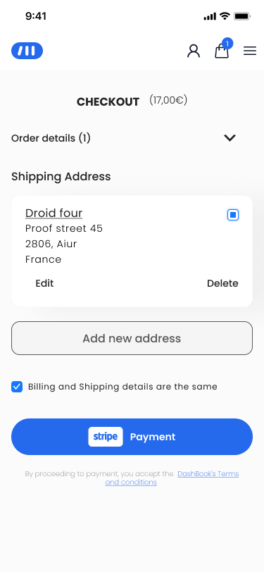
3. Predictable Feedback & Error Handling
Standardized system states to reduce uncertainty during payment.
Inline validation prevents repeated failed attempts.
Clear processing state reduces uncertainty and double submissions.
Explicit confirmation reinforces completion.
What changed?
- Reorganized content hierarchy to prioritize order summary and key actions.
- Reduced visual density and improved grouping of form fields.
- Applied progressive disclosure to avoid overwhelming users.
Trade-off: Some secondary options were deprioritized to maintain clarity and speed.
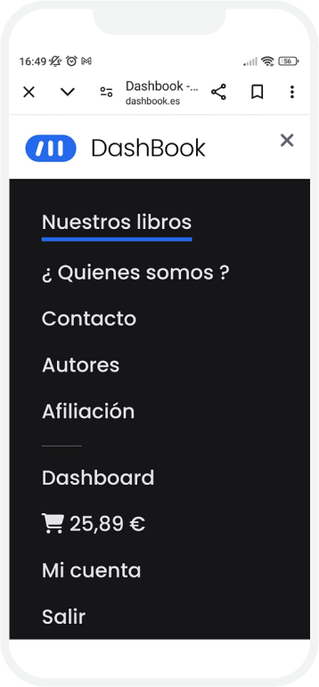
Beyond the checkout
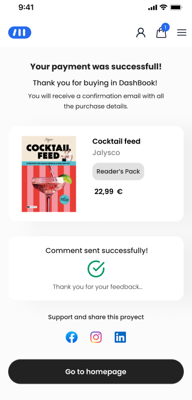
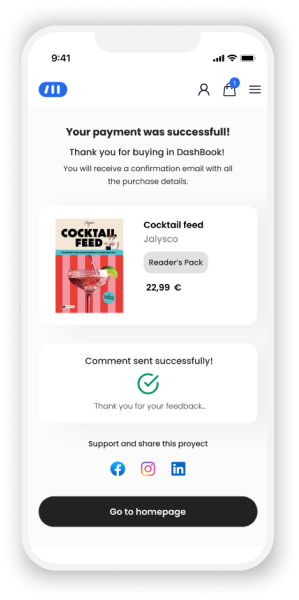
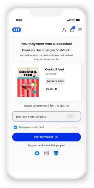
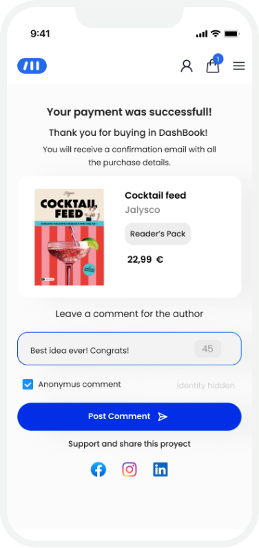
While the initial goal was to resolve critical friction points within the checkout flow, the redesign revealed inconsistencies beyond the payment step. The experience after confirmation lacked structure, clarity, and continuity. We expanded the scope to ensure the purchase experience didn’t end at payment. This led to:
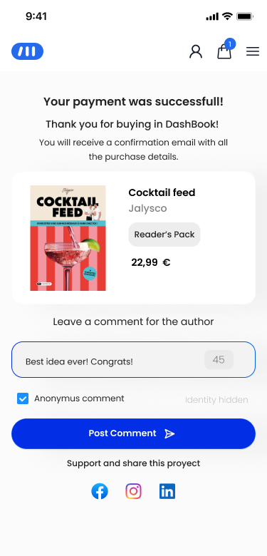
- A redesigned confirmation page with clear purchase details and contextual creator messaging.
- A structured success state reinforcing completion and next steps.
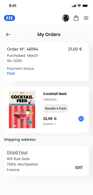
Improved visibility into order and shipping status.
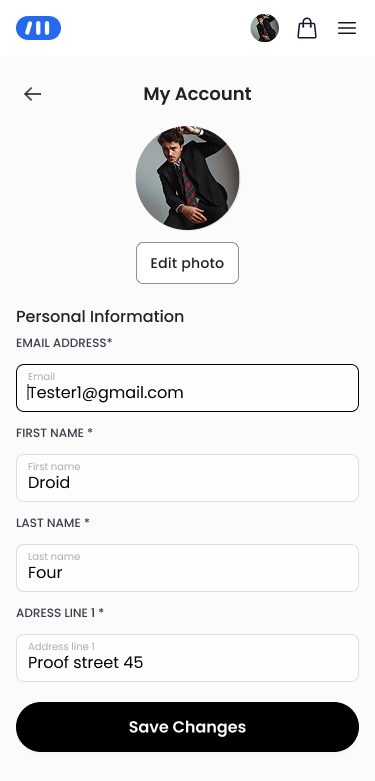
A new user settings area allowing users to update delivery information.
The checkout evolved from a fragile transactional step into a stable and cohesive purchase system.
Final Experience Overview
A cohesive, end-to-end purchase experience built to reduce friction and improve reliability.
From friction to flow
Checkout friction led to high drop-offs. The redesign improved clarity and flow, increasing completion rates.
Checkout funnel before redesign

PRODUCT PAGE

ADD TO CART

Checkout Start

CHECKOUT

PURCHASES
CRITICAL DROP-OFF ZONE

CHECKOUT FRICTION
Authentication friction
Payment confusion
Retry behavior
Failed Purchases
520 failed purchases / month at checkout
From friction-heavy checkout to a seamless purchase flow
Checkout funnel after redesign

PRODUCT PAGE

ADD TO CART

Checkout Start

CHECKOUT

PURCHASES
SEAMLESS CHECKOUT
Simplified authentication
Clear payment states
Real-time feedback
Successful purchases
60 failed purchases / month +20% conversion
Impact
↓ 89% Failed Purchase Attempts
(~520 → ~60 per month)
↑ 20% Increase in Checkout Conversion
The checkout redesign removed critical friction in authentication and payment confirmation, turning the purchase flow from a high-failure step into a stable and reliable conversion system.
Operational Impact
- Significant reduction in repeated payment retries.
- Noticeable decrease in checkout-related support tickets.
- Improved stability during peak campaign periods.
- Reduced revenue leakage at the final purchase step.
Business Impact
- Shifted the checkout from a revenue bottleneck to a stable conversion system.
- Increased campaign reliability during limited-time pre-order windows.
- Reduced operational strain on product and support teams.
- Improved predictability of campaign performance.
Learnings
- Conversion failures are often structural, not behavioral — even highly motivated users abandon when systems feel unstable.
- Mobile-first design demands prioritization and clarity, especially in high-stakes transactional flows.
- Working within backend limitations sharpened decision-making and reinforced the importance of viable, not ideal, solutions.
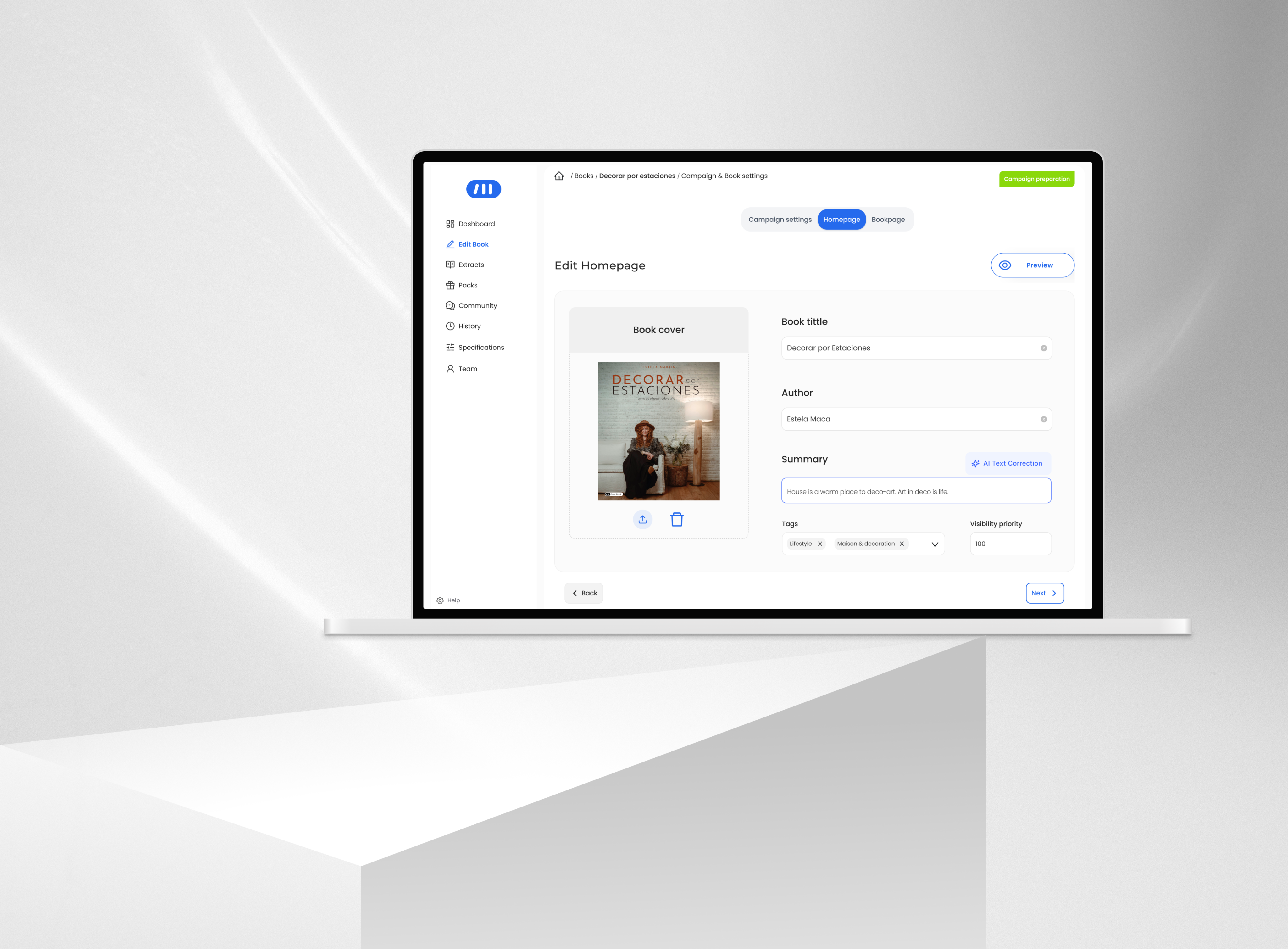
From complex Dashboards to Checkout flows, see the breadth of my Design Projects.
More projects
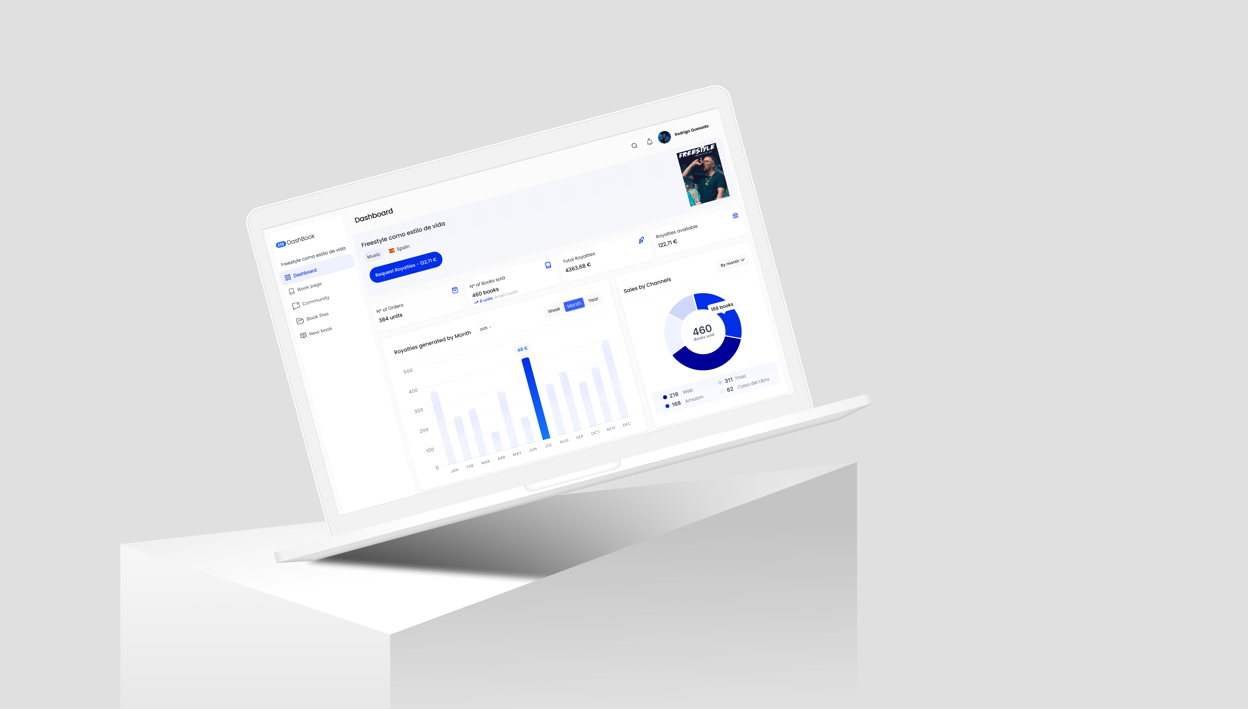
Product Design | In-house software | AI Prototyping
Internal Tool for Content Operations
View case study


Checkout Redesign for a
Pre-order E-commerce Platform
A mobile-first redesign of DashBook’s checkout focused on reducing failed purchases and improving conversion during high-intent
pre-order campaigns.
↓ 89 % failed purchase attempts (520 → ~60 per month)
Mobile first
Project overview
Product: Content Creator Publishing Platform · Pre-order E-commerceCompany stage: Scale-upRole: UX/UI Designer — Lead DesignerPlatform: Mobile-first (Desktop supported)Status: Launched
Problem
Despite strong purchase intent and time-sensitive campaigns, the checkout had evolved without a clear mobile-first structure. The flow was desktop-oriented, required mandatory registration, and included inconsistent hierarchy, unclear payment states, and fragile error handling.
This resulted in:
- High rates of failed purchase attempts.
- Repeated retries from the same users.
- Increased support tickets related to payment issues.
- Revenue leakage during peak campaign moments.
These issues not only hurt conversion, but also prevented scalability, directly impacting presale goals, author success, and overall revenue growth. The issue wasn’t lack of demand it was friction at the most critical stage of the purchase journey.
Context
DashBook had transitioned from a startup to a scale-up, running dozens of simultaneous pre-order campaigns each month. The checkout represented the final and most critical step in this time-bound sales journey, where campaign success depended on reaching a minimum threshold within 44 days. Buyers were primarily followers of the creator—high-intent but low-frequency customers often making a one-time purchase during a limited window. With most traffic coming from mobile devices, clarity, speed, and predictability were essential at the moment of payment.
In this context, even small points of friction had an outsized impact on campaign performance and overall revenue.
My Role
I worked as UX/UI Designer and acted as Lead Designer on this initiative, owning the checkout redesign from problem definition to delivery. While the initial request focused on visual improvements, the scope quickly expanded to address structural conversion issues. I redefined the checkout flow architecture, established mobile-first UX principles, and prioritized high-impact friction points in collaboration with the Product Manager and engineering team.


Challenges & Insights
Challenges
- Mobile-dominant traffic in a desktop-oriented flow
- Mandatory authentication and rigid backend dependencies
- Technical debt and lack of design foundations
- High-intent, low-frequency buyers
Insights
Insights were derived from:
- Recurring checkout-related support tickets.
- Failed payment patterns and repeated retries.
- Direct collaboration with the Product Manager and engineering team.
- Reviewing user behavior during active campaign peaks.
- Internal Data analysis and Google Analytics.
User Behavior Snapshot
(May–July)
From May to July, analysis of user behavior revealed a critical breakdown in the checkout funnel:
- 520 failed purchase attempts per month
- 80,780 users added a product to cart
- 56,000 completed their purchase (69% checkout completion rate)
- +85% of traffic came from mobile devices
Mobile Users
198,474
6.8% of total traffic

Failed purchase
520 failed attempts / month
Added to Cart
80,780 users
39.4% conversion rate
Checkout
56,000 orders
69.3% checkout completion
Key Insights
High-intent, low-frequency buyers
Even emotionally invested buyers abandon when checkout feels unclear or unstable.
Mobile-first is not a visual decision, but a structural one
Clear hierarchy, fewer decisions per screen,input states, error handling, and immediate feedback are critical under constrained conditions.
Checkout is a fragile system
Small UX inconsistencies can cascade into failed payments and revenue loss.
Building empathy: User Persona
To move from raw insights to actionable decisions, I synthesized the observed behaviors, motivations, and friction points into structured representations of the user experience. Based on the research findings, I created a Persona to keep design decisions grounded in real user needs and behaviors throughout the process.
Emma
28 | Paris| Marketing Manager
Emma Laurent
Marketing Manager
Emma likes to follow every post and news of her favourite Influencer. She just found that the influencer just write a book and is on presales.
Goals
- See the influencer video post and know more about it.
- Go to DashBook’s web and see the book project.
- Buy the book on presales.
- Leave a support comment to the influencer.
Motivations
Emma wants to buy the book no matter what and wait for it to be published. She wants to support her favourite influencer.
Pain Points
- sHE Doesn’t trust websites that never heard about.
- She is used to buy things with her cellphone.
- She has to register several times.
- she can’t find where is her purchase on the website.
Experience Map
To better understand where friction and drop-offs were occurring, I mapped the end-to-end user journey — capturing key interactions, emotional states, and potential abandonment points across each phase.
The journey revealed that the highest risk of drop-off concentrated between the acquisition and activation phases particularly during the transition into checkout. At this stage, users encounter multiple friction points: unclear pricing, unexpected shipping costs, forced account creation, and lack of trust signals.
Design decisions
1. Progressive, Inline Authentication
Reframed authentication as a progressive step within the checkout rather than a blocking prerequisite.
Before
- Full registration required before continuing.
- Context switch.
- Redirect to the homepage after registration.
After
What changed?
- Email-first entry point to detect returning vs new users early.
- Routed users dynamically into sign-in or a lightweight registration
- Reduced required fields and removed unnecessary friction from the initial step
Constraint: Full guest checkout was not feasible due to backend dependencies.
2. Mobile-First Structural Hierarchy
Rebuilt the checkout structure around mobile behavior instead of desktop logic.
Before
- Dense layout
- Weak hierarchy
- CTA competing with other elements
After
What changed?
- Reorganized content hierarchy to prioritize order summary and key actions.
- Reduced visual density and improved grouping of form fields.
- Applied progressive disclosure to avoid overwhelming users.
Trade-off: Some secondary options were deprioritized to maintain clarity and speed.
3. Predictable Feedback & Error Handling
Standardized system states to reduce uncertainty during payment.
Inline validation prevents repeated failed attempts.
Clear processing state reduces uncertainty and double submissions.
Explicit confirmation reinforces completion.
What changed?
- Real-time input validation.
- Clear payment processing and success states.
- Immediate system feedback after key actions.
Constraint: Required coordination with engineering across payment integrations.
Beyond the Checkout
While the initial goal was to resolve critical friction points within the checkout flow, the redesign revealed inconsistencies beyond the payment step. The experience after confirmation lacked structure, clarity, and continuity. We expanded the scope to ensure the purchase experience didn’t end at payment. This led to:
- A redesigned confirmation page with clear purchase details and contextual creator messaging.
- A structured success state reinforcing completion and next steps.
Improved visibility into order and shipping status.
A new user settings area allowing users to update delivery information.
The checkout evolved from a fragile transactional step into a stable and cohesive purchase system.
Final Experience Overview
A cohesive, end-to-end purchase experience built to reduce friction and improve reliability.
From friction to flow
Checkout friction led to high drop-offs. The redesign improved clarity and flow, increasing completion rates.
Checkout funnel before redesign

PRODUCT PAGE

ADD TO CART

Checkout Start

CHECKOUT

PURCHASES
CRITICAL DROP-OFF ZONE

CHECKOUT FRICTION
Authentication friction
Payment confusion
Retry behavior
Failed Purchases
520 failed purchases / month at checkout
From friction-heavy checkout to a seamless purchase flow
Checkout funnel after redesign
PRODUCT PAGE
ADD TO CART
Checkout Start

CHECKOUT

PURCHASES
60 failed purchases / month +20% conversion
Impact
↓ 89% Failed Purchase Attempts
(~520 → ~60 per month)
↑ 20% Increase in Checkout Conversion
The checkout redesign removed critical friction in authentication and payment confirmation, turning the purchase flow from a high-failure step into a stable and reliable conversion system.
Operational Impact
- Significant reduction in repeated payment retries.
- Noticeable decrease in checkout-related support tickets.
- Improved stability during peak campaign periods.
- Reduced revenue leakage at the final purchase step.
Business Impact
- Shifted the checkout from a revenue bottleneck to a stable conversion system.
- Increased campaign reliability during limited-time pre-order windows.
- Reduced operational strain on product and support teams.
- Improved predictability of campaign performance.
Learnings
- Conversion failures are often structural, not behavioral — even highly motivated users abandon when systems feel unstable.
- Mobile-first design demands prioritization and clarity, especially in high-stakes transactional flows.
- Working within backend limitations sharpened decision-making and reinforced the importance of viable, not ideal, solutions.
From complex Dashboards to Checkout flows, see the breadth of my Design Projects.
More projects
Product Design | In-house software | AI Prototyping
Internal Tool for Content Operations
View case study
JG
Work
About
Contact
JG
Work
About
Contact
Checkout Redesign for a
Pre-order E-commerce Platform
A mobile-first redesign of DashBook’s checkout focused on reducing failed purchases and improving conversion during high-intent
pre-order campaigns.
↓ 89 % failed purchase attempts (520 → ~60 per month)
E-commerce
User Research
Mobile first
Project overview
Product: Content Creator Publishing Platform · Pre-order E-commerceCompany stage: Scale-upRole: UX/UI Designer — Lead DesignerPlatform: Mobile-first (Desktop supported)Status: Launched
Context
DashBook had transitioned from a startup to a scale-up, running dozens of simultaneous pre-order campaigns each month. The checkout represented the final and most critical step in this time-bound sales journey, where campaign success depended on reaching a minimum threshold within 44 days. Buyers were primarily followers of the creator—high-intent but low-frequency customers often making a one-time purchase during a limited window. With most traffic coming from mobile devices, clarity, speed, and predictability were essential at the moment of payment.
In this context, even small points of friction had an outsized impact on campaign performance and overall revenue.
Problem
Despite strong purchase intent and time-sensitive campaigns, the checkout had evolved without a clear mobile-first structure. The flow was desktop-oriented, required mandatory registration, and included inconsistent hierarchy, unclear payment states, and fragile error handling.
This resulted in:
- High rates of failed purchase attempts.
- Repeated retries from the same users.
- Increased support tickets related to payment issues.
- Revenue leakage during peak campaign moments.
These issues not only hurt conversion, but also prevented scalability, directly impacting presale goals, author success, and overall revenue growth. The issue wasn’t lack of demand it was friction at the most critical stage of the purchase journey.


My Role
I worked as UX/UI Designer and acted as Lead Designer on this initiative, owning the checkout redesign from problem definition to delivery. While the initial request focused on visual improvements, the scope quickly expanded to address structural conversion issues. I redefined the checkout flow architecture, established mobile-first UX principles, and prioritized high-impact friction points in collaboration with the Product Manager and engineering team.
User Behavior Snapshot
(May–July)
From May to July, analysis of user behavior revealed a critical breakdown in the checkout funnel:
- 520 failed purchase attempts per month
- 80,780 users added a product to cart
- 56,000 completed their purchase (69% checkout completion rate)
- Over 95% traffic came from mobile devices

Mobile Users
198,474
96.8% of total traffic
Failed purchase
520 failed attempts / month
Added to Cart
80,780 users
39.4% conversion rate

Checkout
56,000 orders
69.3% checkout completion
Challenges & Insights
Challenges
- Mobile-dominant traffic in a desktop-oriented flow
- Mandatory authentication and rigid backend dependencies
- Technical debt and lack of design foundations
- High-intent, low-frequency buyers
Insights
Insights were derived from:
- Recurring checkout-related support tickets.
- Failed payment patterns and repeated retries.
- Direct collaboration with the Product Manager and engineering team.
- Reviewing user behavior during active campaign peaks.
- Internal Data analysis and Google Analytics.
Key Insights
High-intent, low-frequency buyers
Even emotionally invested buyers abandon when checkout feels unclear or unstable.
Mobile-first is not a visual decision, but a structural one
Clear hierarchy, fewer decisions per screen,input states, error handling, and immediate feedback are critical under constrained conditions.
Checkout is a fragile system
Small UX inconsistencies can cascade into failed payments and revenue loss.
Building empathy: User Persona
To move from raw insights to actionable decisions, I synthesized the observed behaviors, motivations, and friction points into structured representations of the user experience. Based on the research findings, I created a Persona to keep design decisions grounded in real user needs and behaviors throughout the process.
Emma
28 | Paris| Marketing Manager

Emma Laurent
Marketing Manager
Emma likes to follow every post and news of her favourite Influencer. She just found that the influencer just write a book and is on presales.
Goals
- See the influencer video post and know more about it.
- Go to DashBook’s web and see the book project.
- Buy the book on presales.
- Leave a support comment to the influencer.
Motivations
Emma wants to buy the book no matter what and wait for it to be published. She wants to support her favourite influencer.
Pain Points
- sHE Doesn’t trust websites that never heard about.
- She is used to buy things with her cellphone.
- She has to register several times.
- she can’t find where is her purchase on the website.
This persona represents a high-intent but low-frequency buyer — typically arriving from an author’s audience, with little prior knowledge of the platform and a strong expectation for a fast and frictionless purchase experience.
Experience Map
To better understand where friction and drop-offs were occurring, I mapped the end-to-end user journey — capturing key interactions, emotional states, and potential abandonment points across each phase.
The journey revealed that the highest risk of drop-off concentrated between the acquisition and activation phases particularly during the transition into checkout. At this stage, users encounter multiple friction points: unclear pricing, unexpected shipping costs, forced account creation, and lack of trust signals.
Design decisions
The design strategy focused on reducing friction at critical moments, simplifying the checkout flow, and increasing clarity and trust throughout the purchase experience.
1. Progressive, Inline Authentication
Reframed authentication as a progressive step within the checkout rather than a blocking prerequisite.
Before
- Full registration required before continuing
- Context switch
- Redirect to the homepage after registration
After
What changed?
- Email-first entry point to detect returning vs new users early.
- Routed users dynamically into sign-in or a lightweight registration
- Reduced required fields and removed unnecessary friction from the initial step
Constraint: Full guest checkout was not feasible due to backend dependencies.
2. Mobile-First Structural Hierarchy
Rebuilt the checkout structure around mobile behavior instead of desktop logic.
Before
- Dense layout
- Weak hierarchy
- CTA competing with other elements
After
What changed?
- Reorganized content hierarchy to prioritize order summary and key actions.
- Reduced visual density and improved grouping of form fields.
- Applied progressive disclosure to avoid overwhelming users.
Trade-off: Some secondary options were deprioritized to maintain clarity and speed.
3. Predictable Feedback & Error Handling
Standardized system states to reduce uncertainty during payment.
Inline validation prevents repeated failed attempts.
Clear processing state reduces uncertainty and double submissions.
Explicit confirmation reinforces completion.
What changed?
- Real-time input validation.
- Clear payment processing and success states.
- Immediate system feedback after key actions.
Constraint: Required coordination with engineering across payment integrations.
Beyond the Checkout
While the initial goal was to resolve critical friction points within the checkout flow, the redesign revealed inconsistencies beyond the payment step. The experience after confirmation lacked structure, clarity, and continuity. We expanded the scope to ensure the purchase experience didn’t end at payment. This led to:
- A redesigned confirmation page with clear purchase details and contextual creator messaging.
- A structured success state reinforcing completion and next steps.
- A new user settings area allowing users to update delivery information.
- Improved visibility into order and shipping status.

The checkout evolved from a fragile transactional step into a stable and cohesive purchase system.
Final Experience Overview
A cohesive, end-to-end purchase experience built to reduce friction and improve reliability.
From friction to flow
Checkout friction led to high drop-offs. The redesign improved clarity and flow, increasing completion rates.
Checkout funnel before redesign

PRODUCT PAGE

ADD TO CART

Checkout Start

CHECKOUT

PURCHASES
CRITICAL DROP-OFF ZONE

CHECKOUT FRICTION
Authentication friction
Payment confusion
Retry behavior
Failed Purchases
520 failed purchases / month at checkout
From friction-heavy checkout to a seamless purchase flow
Checkout funnel after redesign
PRODUCT PAGE
ADD TO CART
Checkout Start

CHECKOUT

PURCHASES
SEAMLESS CHECKOUT
Simplified authentication
Clear payment states
Real-time feedback
Successful purchases
60 failed purchases / month +20% conversion
Impact
↓ 89% Failed Purchase Attempts
(520 → 60 per month)
↑ 20% Increase in Checkout Conversion
The checkout redesign removed critical friction in authentication and payment confirmation, turning the purchase flow from a high-failure step into a stable and reliable conversion system.
Operational Impact
- Significant reduction in repeated payment retries.
- Noticeable decrease in checkout-related support tickets.
- Improved stability during peak campaign periods.
- Reduced revenue leakage at the final purchase step.
Business Impact
- Shifted the checkout from a revenue bottleneck to a stable conversion system.
- Increased campaign reliability during limited-time pre-order windows.
- Reduced operational strain on product and support teams.
- Improved predictability of campaign performance.
Learnings
- Conversion failures are often structural, not behavioral — even highly motivated users abandon when systems feel unstable.
- Mobile-first design demands prioritization and clarity, especially in high-stakes transactional flows.
- Working within backend limitations sharpened decision-making and reinforced the importance of viable, not ideal, solutions.
From complex Dashboards to Checkout flows, see the breadth of my Design Projects.
More projects
Product Design | In-house software | AI Prototyping
Internal Tool for Content Operations
View case study